[PT]
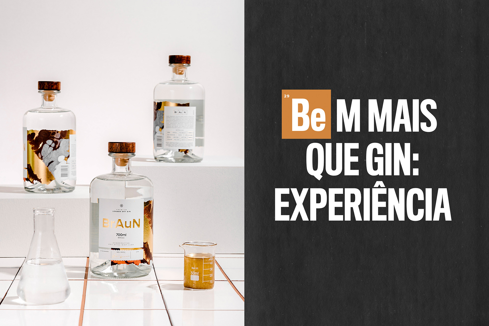
Embalagem + Identidade Visual
Braun Gin
A história dos Braun começa há cerca de 500 anos atrás, quando alquimistas ingleses gritaram "eureka!" ao adicionar zimbro a uma mistura alcoólica. A BrAuN surgiu dessa herança, que une química e destilaria. Através dessa mistura, pai e filho criaram um gin de alta qualidade, digno de seus antepassados.
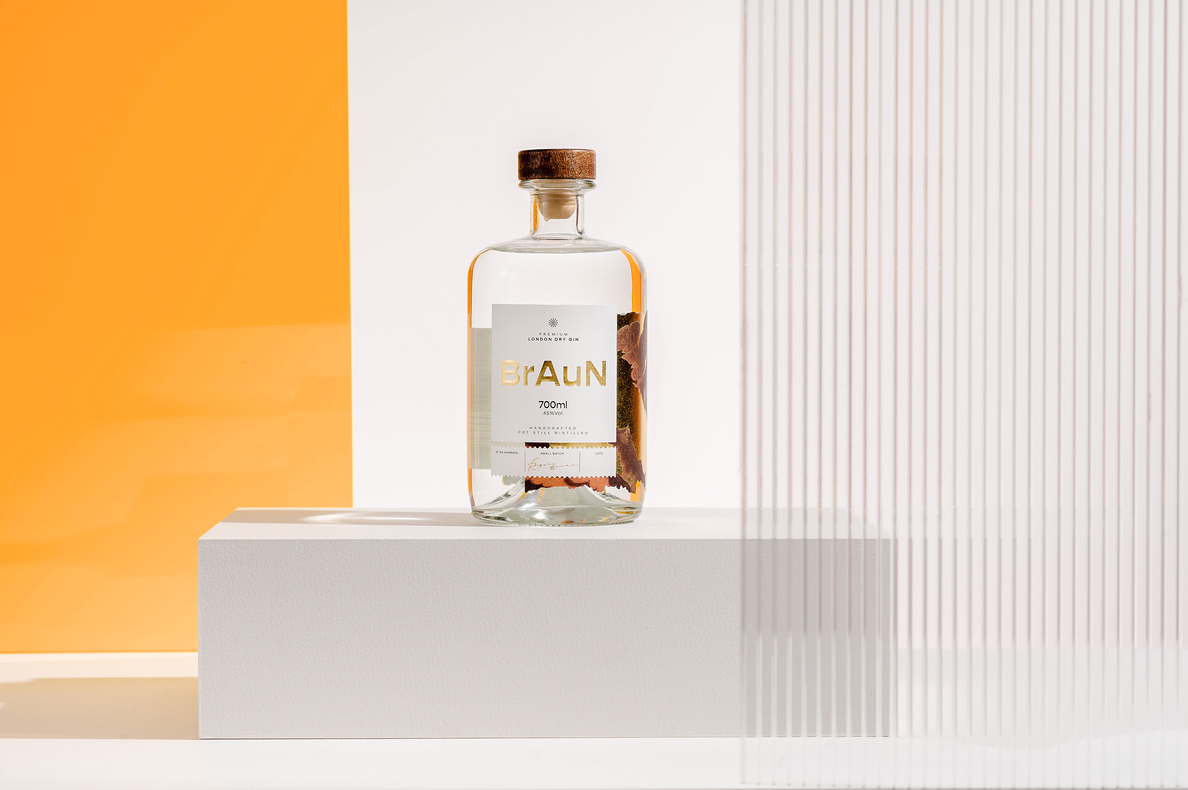
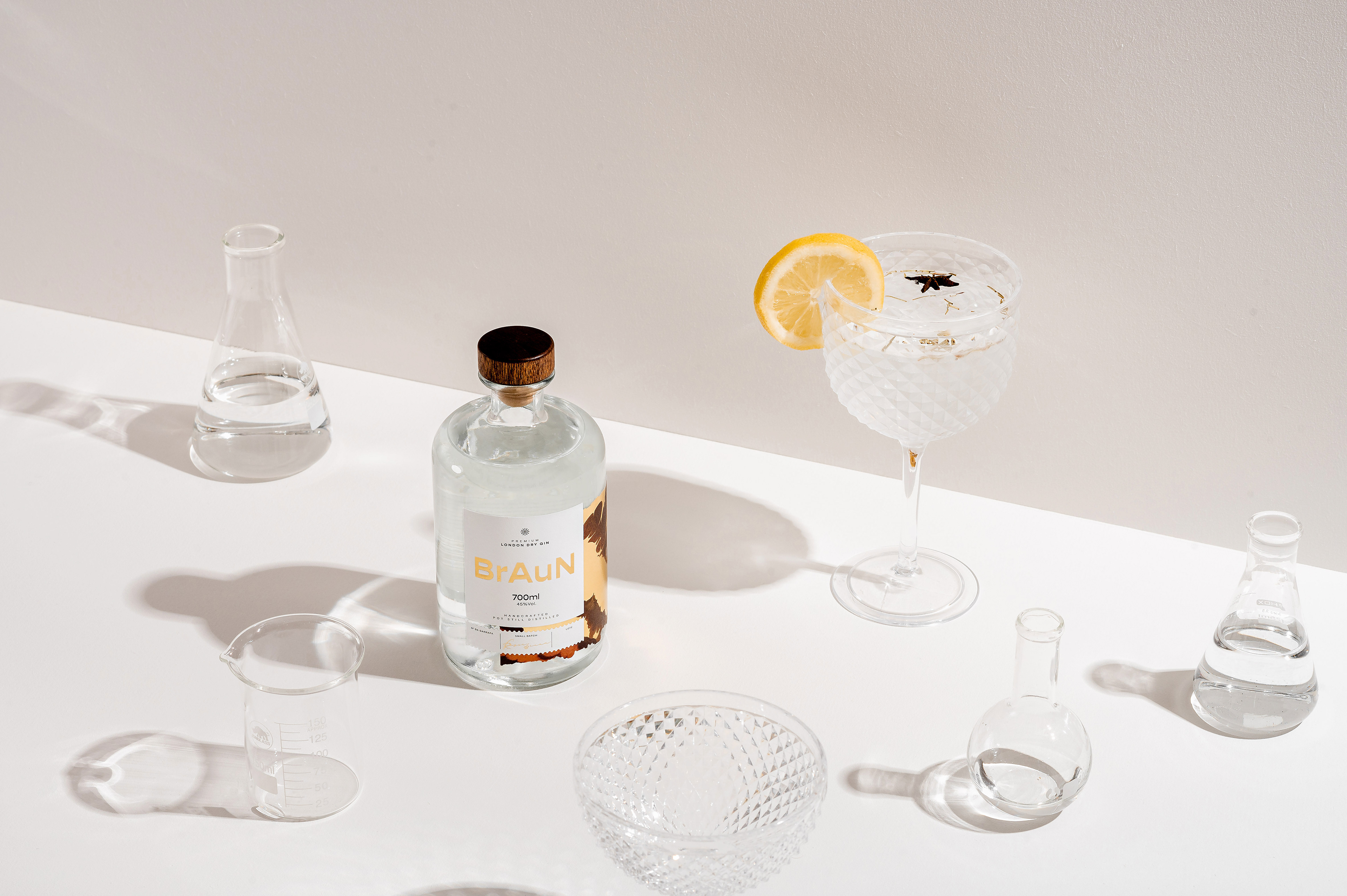
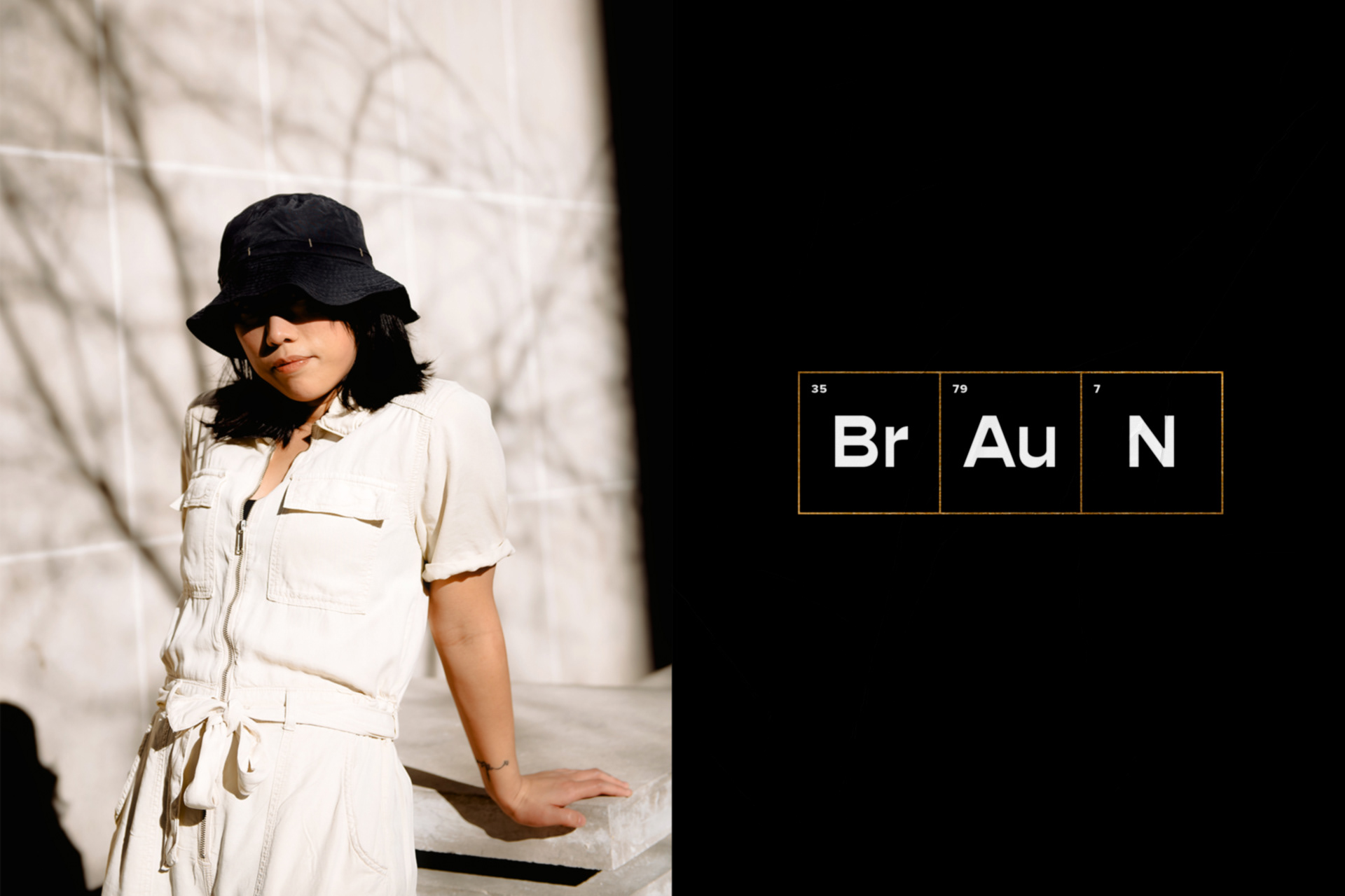
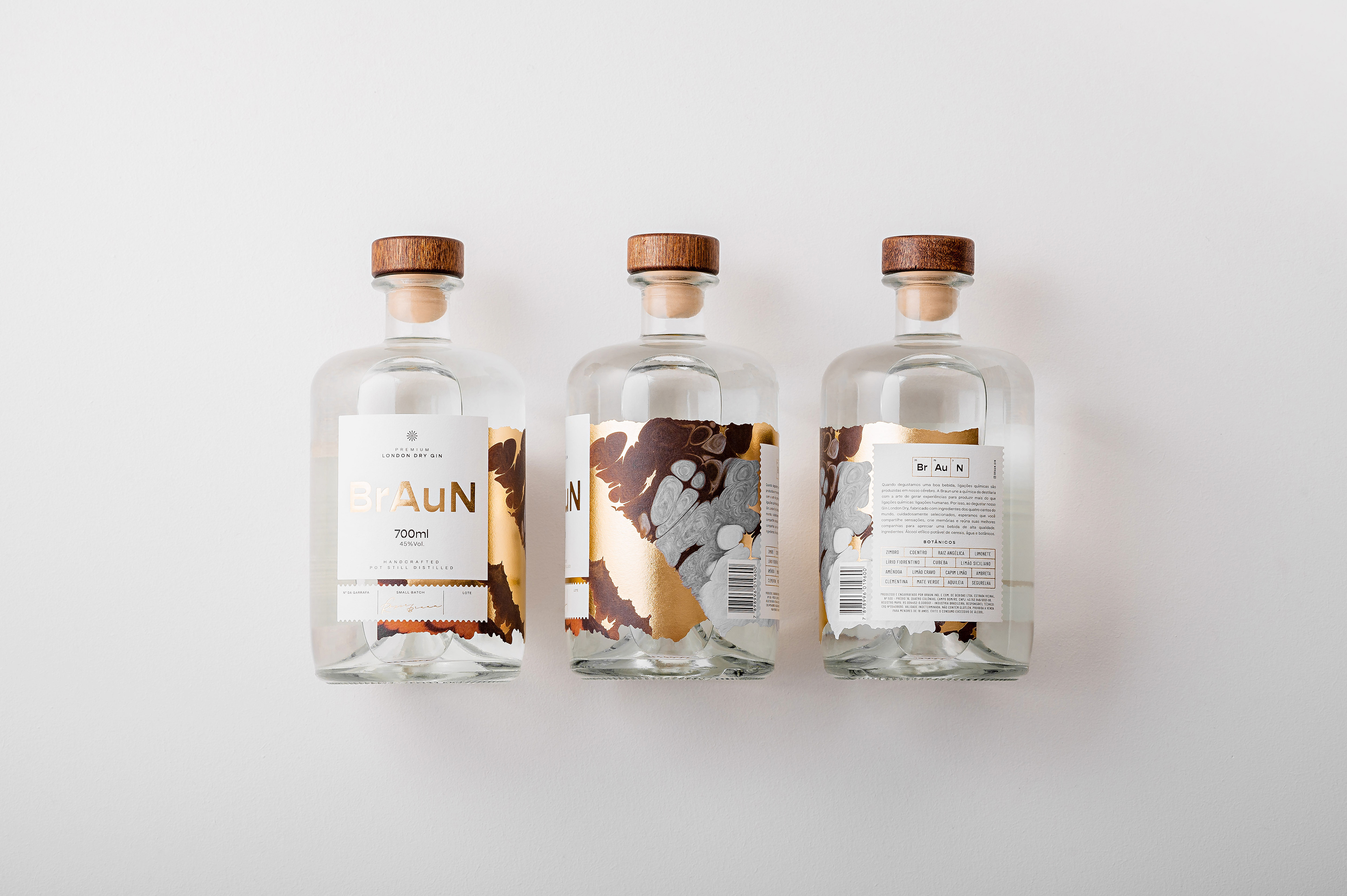
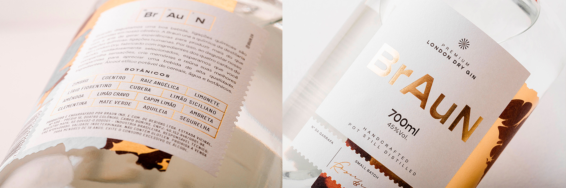
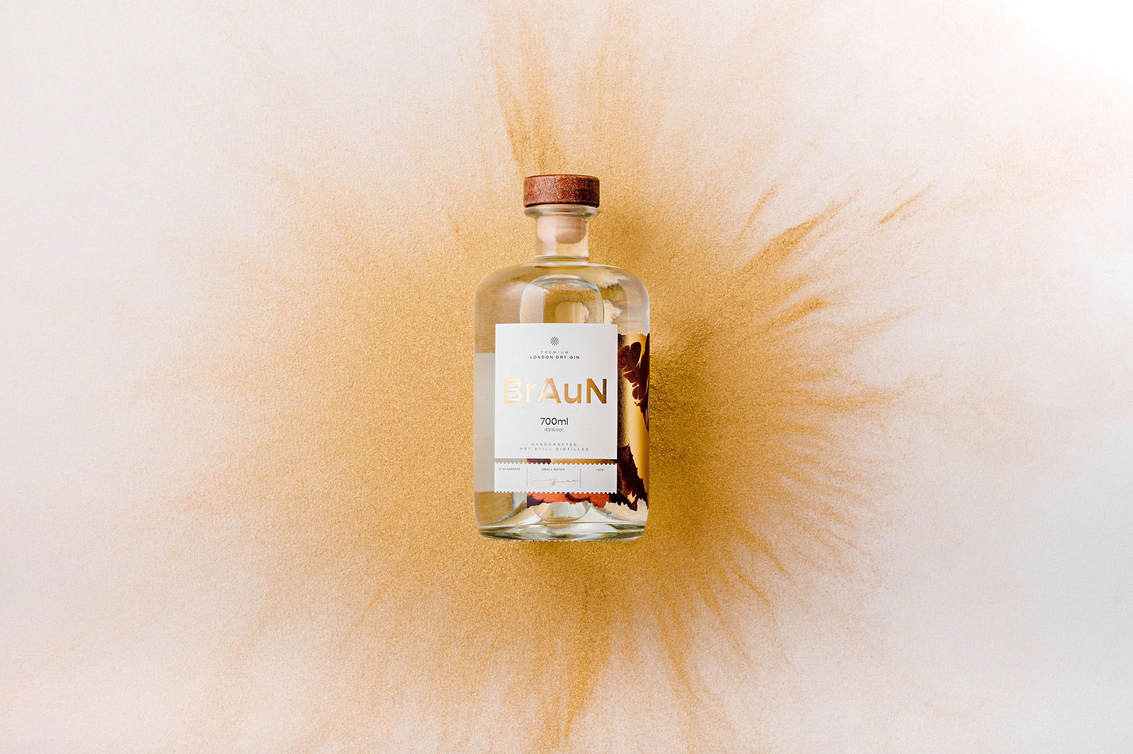
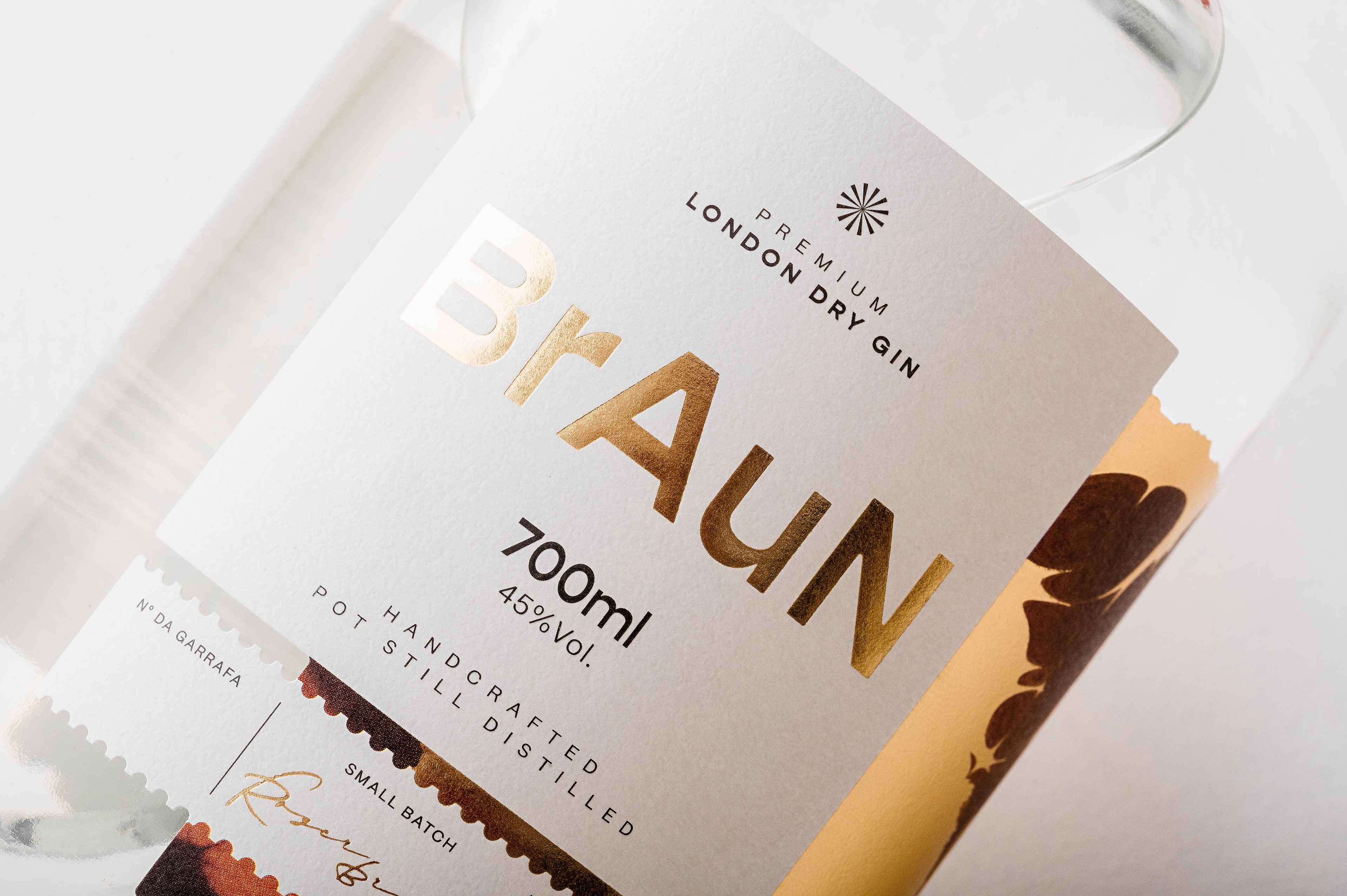
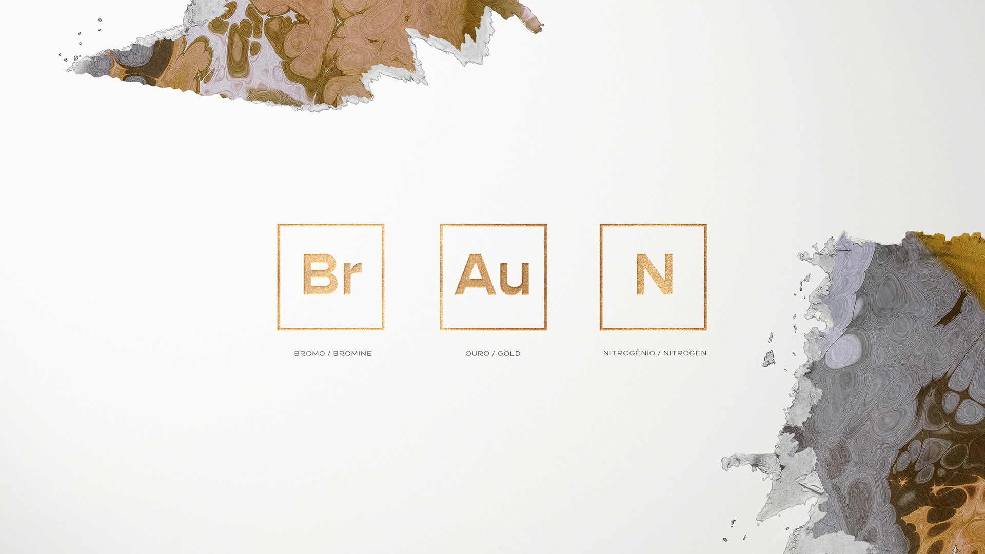
Química, destilaria e tradição de família são os territórios dessa marca, que sintetiza essas paixões em seu propósito: "destilar histórias e extrair mais do que ligações químicas: ligações humanas". Elementos da tabela periódica estão presentes tanto no logotipo - (Br) Bromo (Au) Ouro (N) Nitrogênio - quanto nos detalhes da impressão da embalagem. Nesta, destaca-se a textura lateral como elemento sensorial, criada a partir de reações químicas vistas através do microscópio. Em partes dela, foi aplicado hot stamping, dando a sensação de que a reação está acontecendo. O corte irregular, feito em faca desenvolvida especialmente para o projeto, enfatiza o efeito. Além disso, a forma da garrafa lembra vidrarias químicas utilizadas antigamente pelos boticários, reforçando o storytelling.
A embalagem, dessa forma, torna-se uma extensão da experiência da marca, a qual se propõe justamente a provocar ligações humanas entre as pessoas que compartilham sensações e memórias em torno de uma bebida de alta qualidade. Assim, utilizando o storytelling como solução de projeto, foi possível gerar valor e diferenciação para os apreciadores de gin mais exigentes.
[EN]
Packaging + Visual Identity
Braun's family story begins about 500 years ago, when English alchemists shouted "eureka!" by adding juniper to an alcoholic mixture. BrAuN emerged from this heritage, which unites chemistry and distillery. Through this mixture, father and son created a high quality gin, worthy of their ancestors.
Chemistry, distillery, and family tradition are this brand's territories, which synthesizes these passions in its purpose: "to distill stories and extract more than chemical bonds: human bonds". Elements of the periodic table are present both in the logo - (Br) Bromine (Au) Gold (N) Nitrogen - and in the details of the packaging. In its printing, the lateral texture stands out as a sensorial element, created from chemical reactions seen through the microscope. In parts of it, gold hot stamping was applied, giving the feeling that the reaction is really happening. The label irregular cut, specially developed for the project, emphasizes the effect. In addition, the shape of the bottle resembles chemical glassware commonly used by apothecaries in the past, reinforcing the storytelling.
So, the packaging becomes an extension of the brand's experience, which is intended precisely to provoke human connections between people who share sensations and memories around a high-quality drink. Thus, using storytelling as a project solution, it was possible to generate value and differentiation for the most demanding gin lovers.